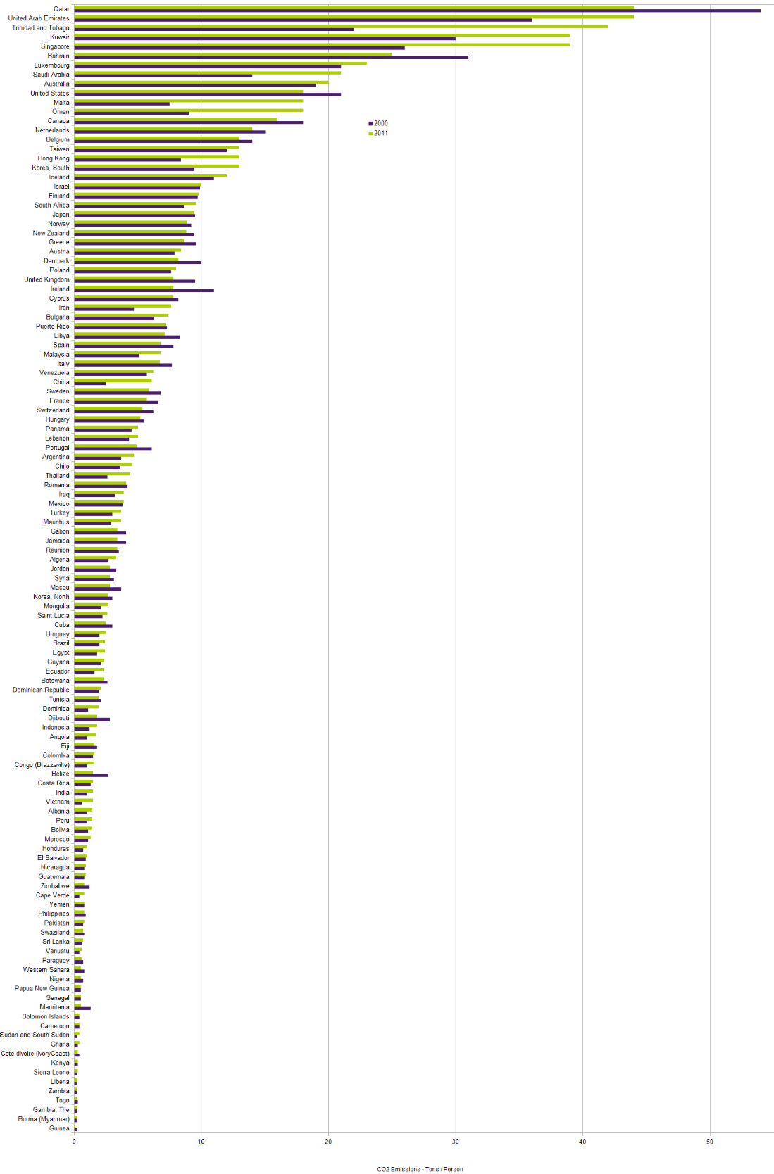
CO2 Emissions by Country
This chart compares the CO2 Emissions per capita (Tons / Person) between 2000 and 2011.
It indicates a countries dedication to tackling CO2 Emissions (and hence climate change). The green bars represent the emissions in 2011 and the blue bars represent the emissions in 2000. Some smaller countries have been excluded from the results.
(the data was obtained from www.eia.gov and processed with the help of our JSON to CSV converter)